The Art of Minimalism in Graphic Design: Less is More
In the world of graphic design, the phrase “less is more” has become a popular mantra. This concept of minimalism, which advocates for simplicity and clarity in design, has been embraced by designers all over the world. It has proven to be a powerful tool in creating effective and impactful designs that communicate the intended message without clutter or confusion.
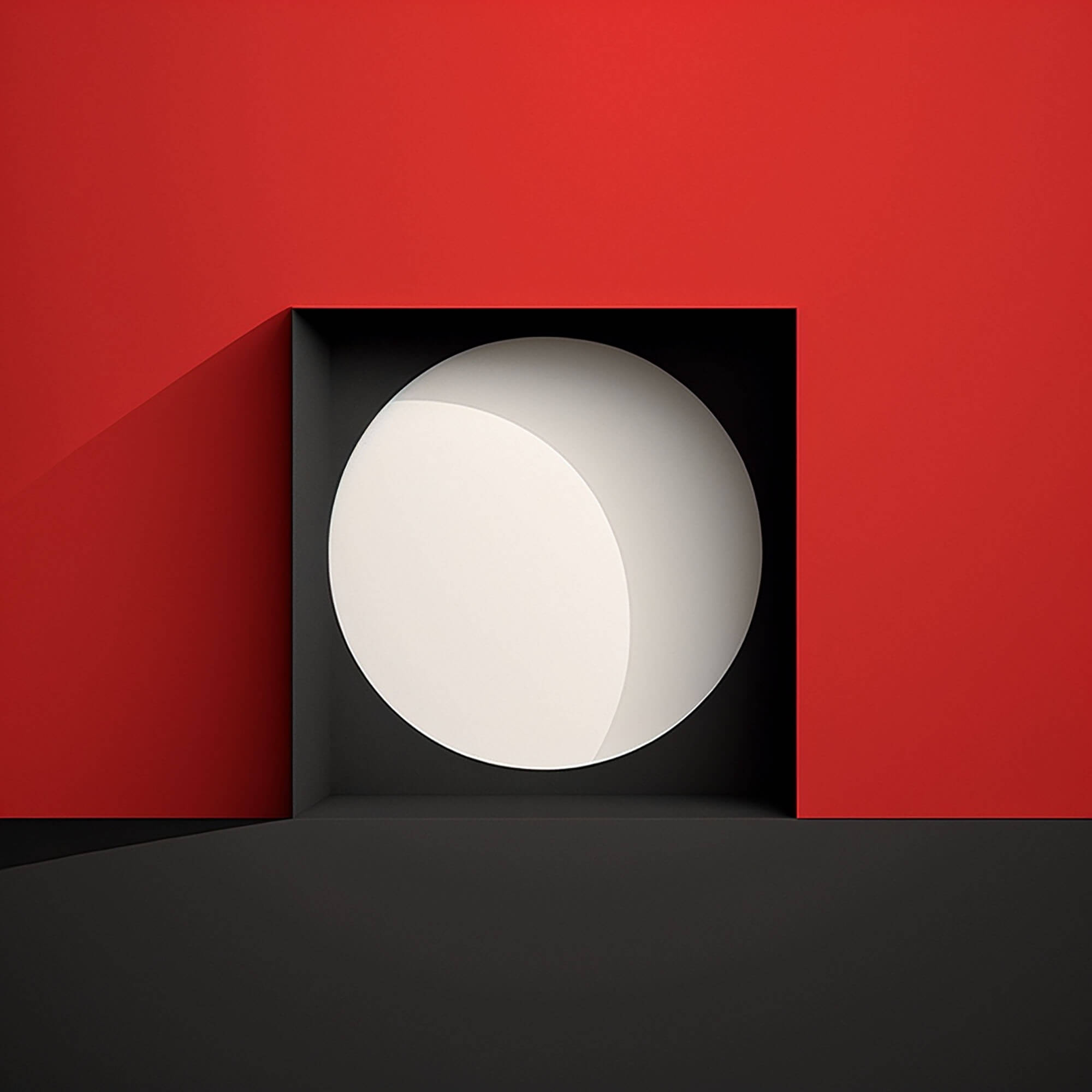
At its core, minimalism is about stripping away the unnecessary elements and focusing on the essentials. It’s about creating a visual hierarchy that guides the viewer’s eye to the most important information. The key is to use only what is essential and remove anything that is not necessary.
In graphic design, minimalism can be achieved through the use of clean lines, ample white space, and simple typography. By removing distractions and unnecessary embellishments, designers can create designs that are easy to read and understand. But, achieving the perfect balance between minimalism and functionality is not an easy task.
The Benefits of Minimalism in Graphic Design
Minimalist design has many benefits. First, it creates a sense of clarity and simplicity that makes the message easy to understand. The use of simple shapes, clean lines, and a limited color palette helps to create a visual hierarchy that guides the viewer’s eye to the most important information.
Secondly, minimalist designs are timeless. Unlike trendy designs that quickly go out of style, minimalism has stood the test of time. It’s a classic design approach that will always be in vogue.
Thirdly, minimalist design is versatile. It can be applied to various mediums, including print, digital, and web design. Whether you’re designing a business card or a website, minimalist design can be used to create an effective and impactful design.
How to Achieve Minimalism in Graphic Design
To achieve minimalism in graphic design, it’s essential to understand the principles of minimalism. Here are some of the key principles to keep in mind:
1.Keep it Simple:
The first rule of minimalism is to keep things simple. Use simple shapes, lines, and colors to create an impactful design.
2.Use Ample White Space:
White space is the area between design elements. It helps to create a visual hierarchy and guide the viewer’s eye to the most important information.
3.Focus on Typography:
Typography is an essential element of design. Use simple fonts and limit the number of fonts used in a design.
4.Use a Limited Color Palette:
Using a limited color palette helps to create a cohesive design that is easy to understand. Limit the number of colors used in a design.
5.Create a Visual Hierarchy:
A visual hierarchy is the order in which the viewer’s eye moves through a design. Use size, color, and placement to create a clear visual hierarchy.
Examples of Minimalist Design
Now that you understand the principles of minimalism in graphic design let’s take a look at some examples.
Apple is a company that has embraced minimalist design in all aspects of its branding. From its logo to its product packaging, Apple’s design is clean, simple, and impactful.
Another example of minimalist design is the branding for Muji, a Japanese retail company. Their design is simple, clean, and emphasizes the beauty of simplicity.
The links provided offer a selection of books about “Graphic Designer and Graphic Design”
- Freelance Jobs and their Profiles: The Freelance Graphic Designer
- Become a freelance graphic designer: How to become a freelance graphic designer step by step
- Project Planner Notebook For Graphic Designer Freelance
- Starting Your Career as a Graphic Designer
- Freelance Graphic Designer Sketch Book – Professional Freelance Graphic Designer Job
- Starting Your Career as a Freelance Illustrator or Graphic Designer
- Designer’s Dictionary of Color
- Color Design Workbook: New, Revised Edition: A Real World Guide to Using Color in Graphic Design
- Color: A Course in Mastering the Art of Mixing Colors
- Color Third Edition: A workshop for artists and designers
- Palette Perfect for Graphic Designers and Illustrators: Colour Combinations, Meanings and Cultural References
- The Complete Color Harmony, Pantone Edition: Expert Color Information for Professional Results
- Pantone: The Twentieth Century in Color: (Coffee Table Books, Design Books, Best Books About Color)
- The New Munsell Student Color Set
Conclusion
Minimalism in graphic design is a powerful tool that can be used to create effective and impactful designs. By focusing on simplicity, clarity, and functionality, designers can create designs that communicate the intended message without clutter or confusion. So, if you want to create designs that stand the test of time, embrace minimalism and remember: less is more.