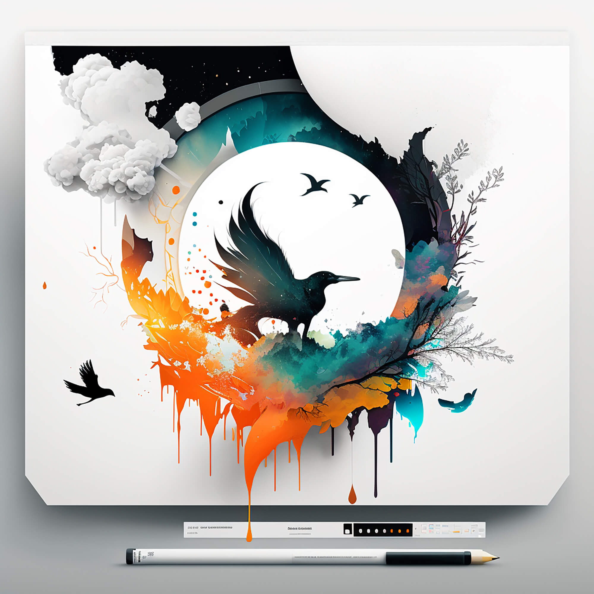
Maximizing White Space in Your Designs
As a designer, you may be tempted to fill every inch of your design with color, text, and graphics. However, leaving white space in your design can be just as important as the content you include. White space, also known as negative space, is the area around and between the elements in your design. When used effectively, white space can improve the readability, clarity, and overall impact of your design.
In this article, we will explore the benefits of maximizing white space in your designs and provide some tips on how to do it effectively.
Why is White Space Important in Design?
White space is not just empty space in your design. It is a deliberate and essential design element that can bring balance, contrast, and emphasis to your content. Here are some of the benefits of maximizing white space in your designs:
1.Improves Readability
White space can improve the readability of your content by making it easier to scan and digest. When there is too much content crammed into a small space, it can be overwhelming for the viewer, and they may be more likely to skip over important information. By leaving enough white space between your text and graphics, you can create a more balanced and readable design.
2.Creates Emphasis
White space can be used to draw attention to specific elements in your design. When you have a lot of competing elements on the page, it can be challenging to direct the viewer’s focus. By strategically adding white space around a specific element, you can create contrast and make it stand out.
3.Enhances Clarity
White space can enhance the clarity of your design by creating separation between different elements. When you have too many elements close together, they can appear cluttered and disorganized. By adding white space between different elements, you can create a clear hierarchy and make it easier for the viewer to understand the relationship between them.
4.Improves Aesthetics
White space can improve the overall aesthetics of your design by creating a sense of elegance and simplicity. When you have too many competing elements, your design can look busy and overwhelming. By leaving enough white space, you can create a more visually appealing design that is easy on the eyes.
Tips for Maximizing White Space in Your Designs
Now that you understand the benefits of maximizing white space in your designs, let’s explore some tips on how to do it effectively.
1.Plan Your Design
Before you start designing, take the time to plan out your layout and the elements you want to include. This will help you determine how much white space you need to include in your design to create balance and contrast.
2.Use Grids
Grids can be a useful tool for creating white space in your design. By dividing your design into a grid, you can ensure that there is enough space between different elements and create a sense of harmony and balance.
3.Embrace Minimalism
Minimalism is a design style that emphasizes simplicity and minimal use of elements. By embracing minimalism, you can create a design that is elegant, clean, and easy to read.
4.Break up Your Content
Breaking up your content into smaller chunks can make it easier to read and digest. Use headlines, subheadings, and bullet points to create white space and draw attention to specific elements.
5.Experiment with Scale and Proportion
Experimenting with scale and proportion can help you create a more balanced and visually appealing design. Use larger elements sparingly to create contrast and draw attention to specific elements.
6.Pay Attention to Margins and Padding
Margins and padding are essential design elements that can help you create white space and improve the overall readability of your design. Use consistent margins and padding throughout your design to create a sense of unity and balance.
The links provided offer a selection of books about “Graphic Designer and Graphic Design”
- Freelance Jobs and their Profiles: The Freelance Graphic Designer
- Become a freelance graphic designer: How to become a freelance graphic designer step by step
- Project Planner Notebook For Graphic Designer Freelance
- Starting Your Career as a Graphic Designer
- Freelance Graphic Designer Sketch Book – Professional Freelance Graphic Designer Job
- Starting Your Career as a Freelance Illustrator or Graphic Designer
- Designer’s Dictionary of Color
- Color Design Workbook: New, Revised Edition: A Real World Guide to Using Color in Graphic Design
- Color: A Course in Mastering the Art of Mixing Colors
- Color Third Edition: A workshop for artists and designers
- Palette Perfect for Graphic Designers and Illustrators: Colour Combinations, Meanings and Cultural References
- The Complete Color Harmony, Pantone Edition: Expert Color Information for Professional Results
- Pantone: The Twentieth Century in Color: (Coffee Table Books, Design Books, Best Books About Color)
- The New Munsell Student Color Set
Conclusion
In conclusion, maximizing white space in your designs can have a significant impact on the readability, clarity, and overall aesthetics of your design. By embracing white space and using it effectively, you can create a more balanced and visually appealing design that is easy to read and understand. Keep in mind the tips we’ve shared in this article, such as planning your design, using grids, embracing minimalism, breaking up your content, experimenting with scale and proportion, and paying attention to margins and padding. With these tips, you can take your design to the next level and create a more impactful and memorable visual experience for your audience.