How to Use Color Theory in Your Designs
Color is a powerful tool that can evoke emotions, create moods and influence the perception of your designs. As a designer, it’s important to understand the basics of color theory and how to use it effectively in your work. In this article, we’ll delve into the world of color theory, from its history and origins to the practical applications of color in design.

Introduction to Color Theory
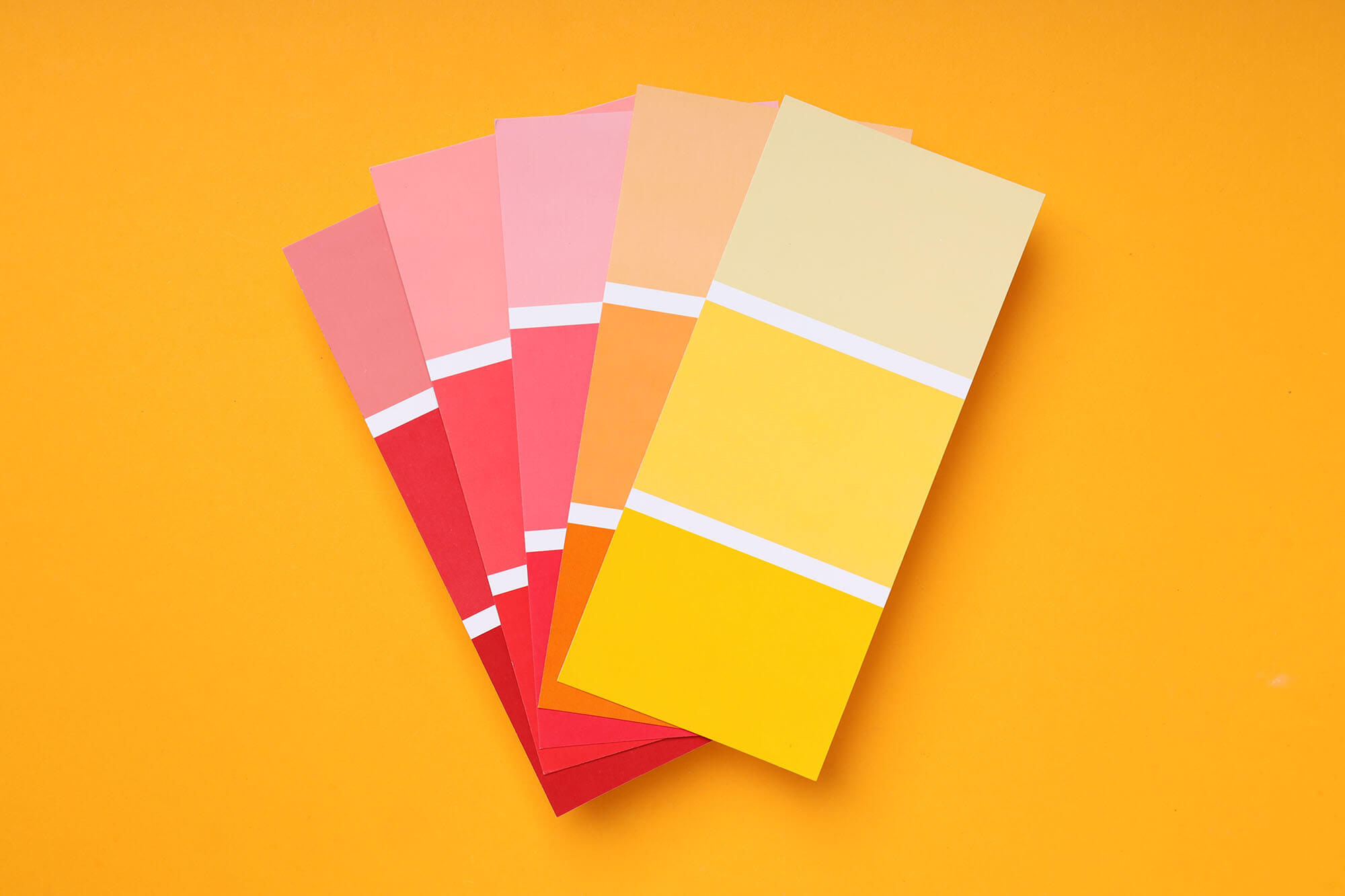
Color theory is the study of color relationships and how they impact visual perception. It provides a framework for selecting and combining colors in a harmonious and aesthetically pleasing way. The history of color theory can be traced back to ancient Greece, where philosopher Aristotle wrote about the emotional responses elicited by different colors. Today, color theory is a well-established field that has been widely studied and used by artists and designers alike.
The Color Wheel and Basic Color Relationships
At the heart of color theory is the color wheel, which consists of primary, secondary, and tertiary colors. The primary colors – red, yellow, and blue – are the basic building blocks of all other colors. Secondary colors are created by mixing two primary colors and are located between the primary colors on the color wheel. Tertiary colors are created by mixing a primary and a secondary color.
How to Use the Color Wheel in Design
There are several ways to use the color wheel to create effective color combinations in your designs. One common approach is to use complementary colors, which are located directly across from each other on the color wheel. For example, blue and orange, green and red, and yellow and purple are complementary color pairs. When used together, these colors create high contrast and a visually dynamic look.
Another way to use the color wheel is to select colors that are next to each other on the wheel, known as analogous colors. Analogous colors create a harmonious and peaceful look, and are often used in nature-inspired designs. For example, using shades of green, blue and turquoise creates a soothing and calming effect.
You can also use the color wheel to create a monochromatic color scheme, where you use various shades and tints of a single color. This creates a cohesive and sophisticated look that can be used in minimalist or modern designs.

How to Choose Colors for Your Designs
When choosing colors for your designs, it’s important to consider the context in which the design will be used. For example, cool colors like blue and green are often associated with calmness and serenity, making them a popular choice for healthcare and wellness designs. On the other hand, warm colors like red and yellow are associated with excitement and energy, making them a good choice for designs in the entertainment or food industry.
It’s also important to consider the target audience and the emotions you want to evoke in your design. For example, if you want to create a design that appeals to children, you might consider using bright, bold colors. On the other hand, if you want to create a more sophisticated look, you might consider using muted, earthy colors.

Real-World Examples of Color Theory in Design
One well-known example of color theory in design is the logo of McDonald’s. The iconic golden arches are a prime example of using a complementary color scheme, with the yellow arches contrasting against the red background. The combination of these two colors creates a bold and memorable visual that is easily recognizable.
Another example of color theory in design can be seen in the branding of sports teams. Many teams use a combination of their team colors to create a strong and recognizable brand image. For example, the Los Angeles Lakers use a combination of purple and yellow in their logo and uniforms, creating a visually striking image that is easily recognizable. The use of these two complementary colors also conveys a sense of royalty and luxury, befitting a team that has won numerous championships.
The color scheme used in Apple’s logo is another example of effective color theory in design. The simple combination of white and a shade of silver creates a sleek and modern look that conveys a sense of innovation and technology. This minimalist color scheme is in line with Apple’s focus on design and simplicity in their products.

FAQs
What is color theory?
Color theory is the study of color relationships and how they impact visual perception. It provides a framework for selecting and combining colors in a harmonious and aesthetically pleasing way.
What is the color wheel?
The color wheel is a visual representation of the relationships between colors, consisting of primary, secondary, and tertiary colors.
What are complementary colors?
Complementary colors are located directly across from each other on the color wheel and create high contrast and a visually dynamic look when used together.
How do you choose colors for a design?
When choosing colors for a design, it’s important to consider the context in which the design will be used, the target audience, and the emotions you want to evoke in your design.
The links provided offer a selection of books about Color Theory in Graphic Design.
- The Designer’s Dictionary of Color
- Color Design Workbook: New, Revised Edition: A Real World Guide to Using Color in Graphic Design
- Color: A Course in Mastering the Art of Mixing Colors
- Color Third Edition: A workshop for artists and designers
- Palette Perfect for Graphic Designers and Illustrators: Colour Combinations, Meanings and Cultural References
- The Complete Color Harmony, Pantone Edition: Expert Color Information for Professional Results
- Pantone: The Twentieth Century in Color: (Coffee Table Books, Design Books, Best Books About Color)
- The New Munsell Student Color Set

Conclusion
In conclusion, color theory is an essential tool for any designer, providing a framework for selecting and combining colors in a visually pleasing way. From the color wheel to real-world examples of color theory in design, there are many ways to use color effectively in your designs. Whether you’re creating a logo, a website, or any other type of visual design, understanding the basics of color theory will help you create designs that are both aesthetically pleasing and effective in conveying your message.
Remember, when using color in your designs, it’s important to consider the context, target audience, and emotions you want to evoke. With these factors in mind, you’ll be able to create designs that are not only visually striking, but also effective in communicating your message. So the next time you’re working on a design, take some time to consider the power of color and how you can use color theory to your advantage.
How to Use Color Theory in Your Designs
Comments
Rachel C.
Costin Constantinescu